PCA eliminates redundancy, condensing attribute variability into a fewer number of bands.
For details on the concepts behind Principal Component transformation check out the ArcMap help: http://desktop.arcgis.com/en/arcmap/latest/tools/spatial-analyst-toolbox/how-principal-components-works.htm
(another website which explains PCA and eigenvalues/vectors very clearly: https://georgemdallas.wordpress.com/2013/10/30/principal-component-analysis-4-dummies-eigenvectors-eigenvalues-and-dimension-reduction/).
I used the Principal Components Tool (Spatial Analyst) in ArcMap on the full Landsat 8 mosaic of Axel Heiberg Island, which consisted of 6 bands (band 2-7). The output of this transformation is a multi-band raster:
PC1:
|
PC2:
 |
PC3:
 |
PC4: Salt is very bright
 |
PC5: Noisy
 |
PC6: No information
 |
(I applied an ice mask)
After PC transformation most of the information is contained within the first four bands, instead of six. I can see that in PC band 4 salt domes have very high attribute values, and thus are very bright.
The color composite: R:4 G:3 B:2 highlights the salt domes in bright yellow, thus both PC bands 4 and 3 have very high values, while band 2 has very low values. Figure below is a subset of the PCA 432 color composite.
 |
| Landsat 8 PCA:432 |
The same transformation was done to the ASTER TIR (thermal) mosaic:
 |
| ASTER: TIR: PCA: 132 |
The salt domes have a bright "beet" color.
Next step is to find a convenient automated method to map the salt. Before I did it manually: created a new shapefile and traced salt domes one by one. This method is good but timeconsuming, moreover, the outcome is highly dependent on the accuracy of the mapper.
The new method I tried is a Supervised Image Classification.
 |
| ASTER: TIR: Training Samples |
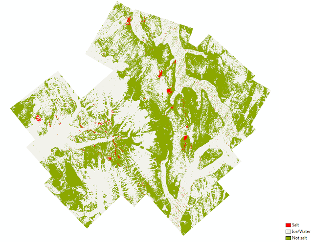
First I had to create training samples. I decided to have just three classes: salt, ice/water and not salt (all other surfaces). After training samples are collected ArcMap allows us to create a signature file, which contains spectral signatures of all the classes in the multidimensional space, thus all bands included in the raster are analyzed. To avoid confusion, before collecting training samples and creating a signature file, I used a Make Raster Layer Tool (Data Management) to isolate only the PC bands which contained useful information (PC: 1,3 and 2).
This way information only from PC bands 1, 3 and 2 was included in the signature file. The next step is to use this signature in the Maximum Likelihood Classification Tool (MLC). MLC assumes that distribution of the attribute values is normal in the multidimensional space (number of dimensions is equal to the number of bands). The algorithm behind the tool calculates statistical probability for each class to include a given cell based on its position in the feature (attribute) space and assigns it to the class which has the highest probability. For more information on how the MLC works check out the ArcMap help section: http://desktop.arcgis.com/en/arcmap/10.3/tools/spatial-analyst-toolbox/how-maximum-likelihood-classification-works.htm
When using the MLC tool there are two inputs: raster file (ASTER TIR PCA) and a signature file, created in the previous step. To get rid of noise I applied a Majority Filter Tool to the classification result. The final classified raster is shown below.
 |
| ASTER: TIR: Supervised Maximum Likelihood Classification |
I think this mapping experiment was very successful. Not in all cases it can be substituted for the manual mapping, but sometimes it can be very handy.

Great job, Maria! I'm really impressed at how well the PCA analysis was able to highlight the salt exposures.
ReplyDelete